Buttons
Buttons enable users to take action and make decisions with just a single tap or click.
Categories
We categorize buttons into three categories based on their intended purpose:

Default
These are your go-to option for general actions. They’re designed to handle everyday tasks and should be the default choice in most scenarios.

Negative
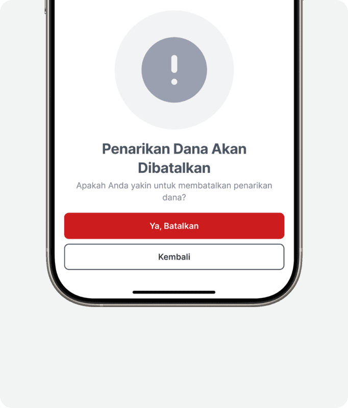
Use these for confirming destructive or irreversible actions, such as deleting a pending order or cancelling a withdrawal. They serve as a clear warning to ensure users are making deliberate decisions.

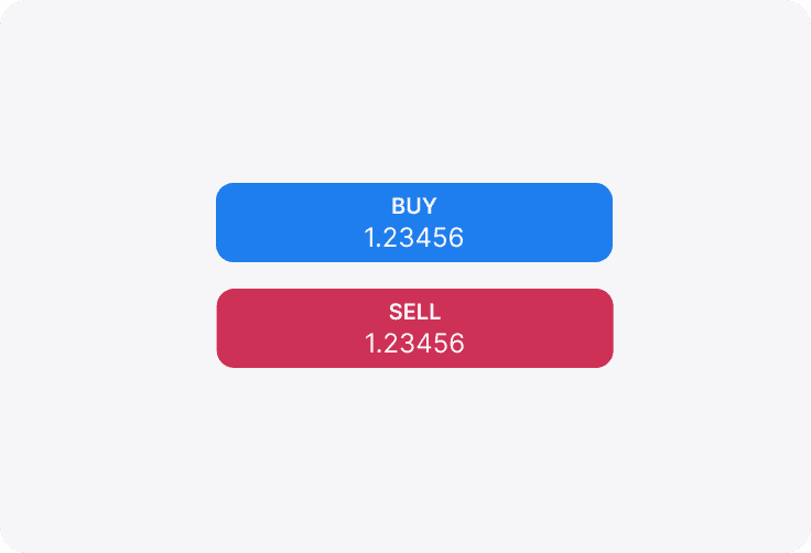
Trading
Specifically crafted for trading functions, these buttons indicate actions like executing a buy or sell trade, making them distinct and immediately recognizable in trading contexts.
Content Types
Specifically for Trading buttons, there are three types of content that can be used for various scenarios.
Single Label
For buttons that only need one text label. Example: Button on Signal Cards.

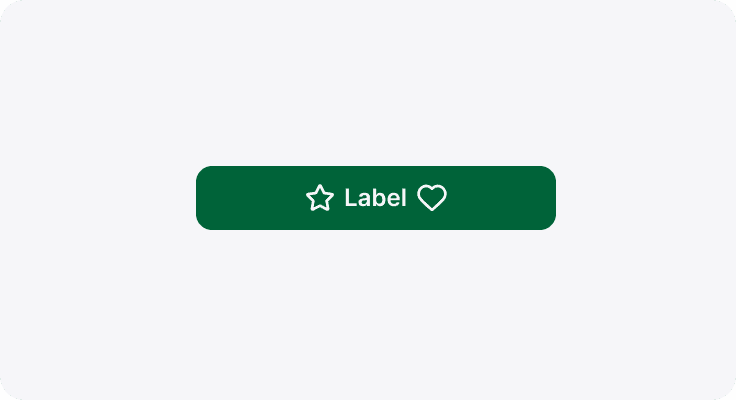
Double Label: Horizontal
For buttons that needs two labels stacked horizontally. Example: Button on Market List, contains Open Position Ratio (OPR).
Double Label: Vertical
For buttons that needs two labels stacked vertically. Example: Button on Chart to execute trades, contains current bid/ask prices.
Hierarchy Types
We categorize buttons into three categories based on their intended purpose:

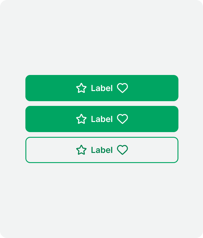
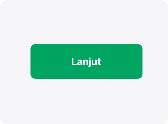
Primary
These represent the most important actions in a flow, such as moving forward, confirming, dismissing, or finalizing a task. Ideal for call-to-action buttons, they are designed to capture immediate user attention.

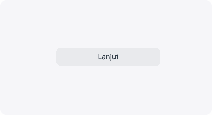
Secondary
Use these when offering alternatives to the primary action or when no single action is overwhelmingly more important. They provide clear options without overshadowing the primary command.
Secondary Neutral
These buttons cater to functional actions that don’t inherently convey a positive sentiment—like copying details, controlling forms, or navigation. They are intended for tasks where a neutral tone is preferable.
Tertiary
Tertiary buttons are designed for actions requiring the least emphasis among the interactive elements. They feature subtle styling and minimal decoration, offering an unobtrusive option for user interaction without drawing excessive focus.

Tertiary Neutral
Similar to tertiary buttons but rendered in a neutral palette, these are used for functional actions where even less visual priority is needed, ensuring that the interface remains calm and balanced.

Text
Representing the minimal visual approach, text buttons use only text styling and are ideal for the lowest hierarchy of actions. They are best suited for scenarios where a subtle, non-distracting interface element is required.

Text Neutral
These follow the same minimal styling as text buttons but with a neutral color tone. They are selected for purely functional interactions that require minimal emphasis, keeping the overall interface balanced and understated.
Sizes
In general, we have 4 button sizes. Just like other elements in our library, we follow a standard size of t-shirt clothing sizes to illustrate those different sizes.
xs
sm
md
lg
States
Buttons in our design system respond visually to various user interactions by transitioning through five distinct states. Each state is essential for guiding user interactions and ensuring that every action is clearly communicated throughout the interface.

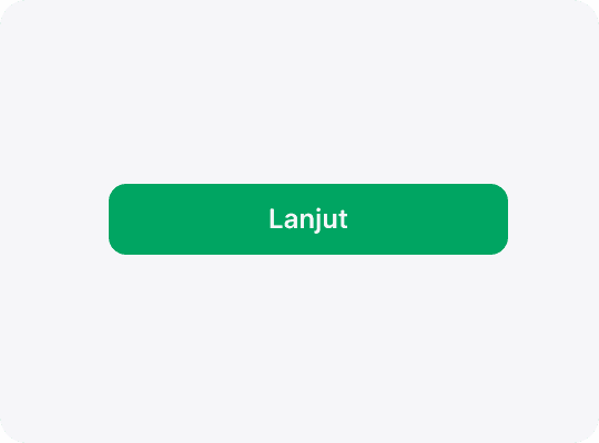
Active
This is the default state when users haven't interacted with the button yet. It represents a ready-to-use action element.

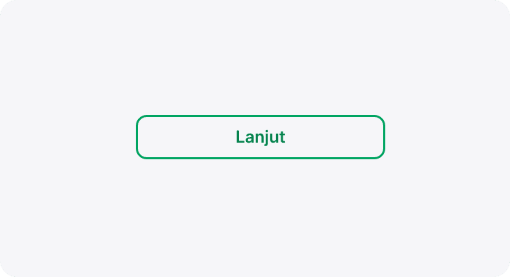
Focused
Specifically designed for accessibility (such as screen reader and keyboard navigation users), the focused state highlights the button when it receives attention, signaling that it’s ready for activation.
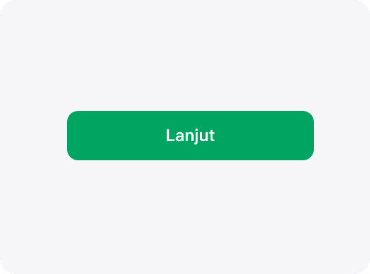
Hover
Applicable only to devices with cursor pointers, the hover state provides immediate visual feedback while user placing their cursor over the button, indicating it’s interactive.

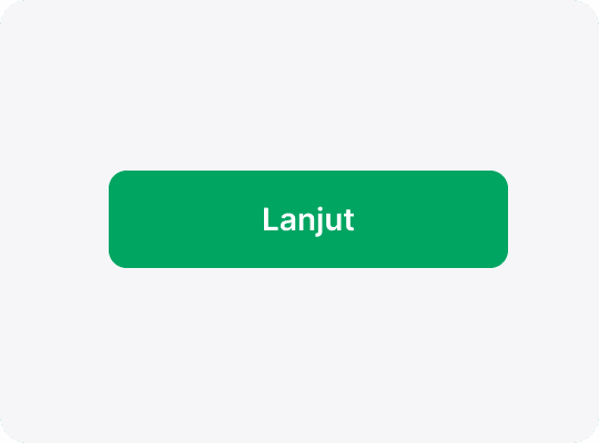
Pressed
This state activates while user clicking or tapping a button. It offers real-time feedback to confirm the action is being executed.
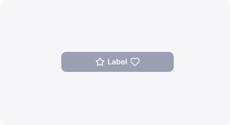
Disabled
When a button is inactive due to contextual reasons (for example, if the action is not available), it displays a disabled state, usually indicated by subdued styling, to clearly communicate that it's not currently operable.
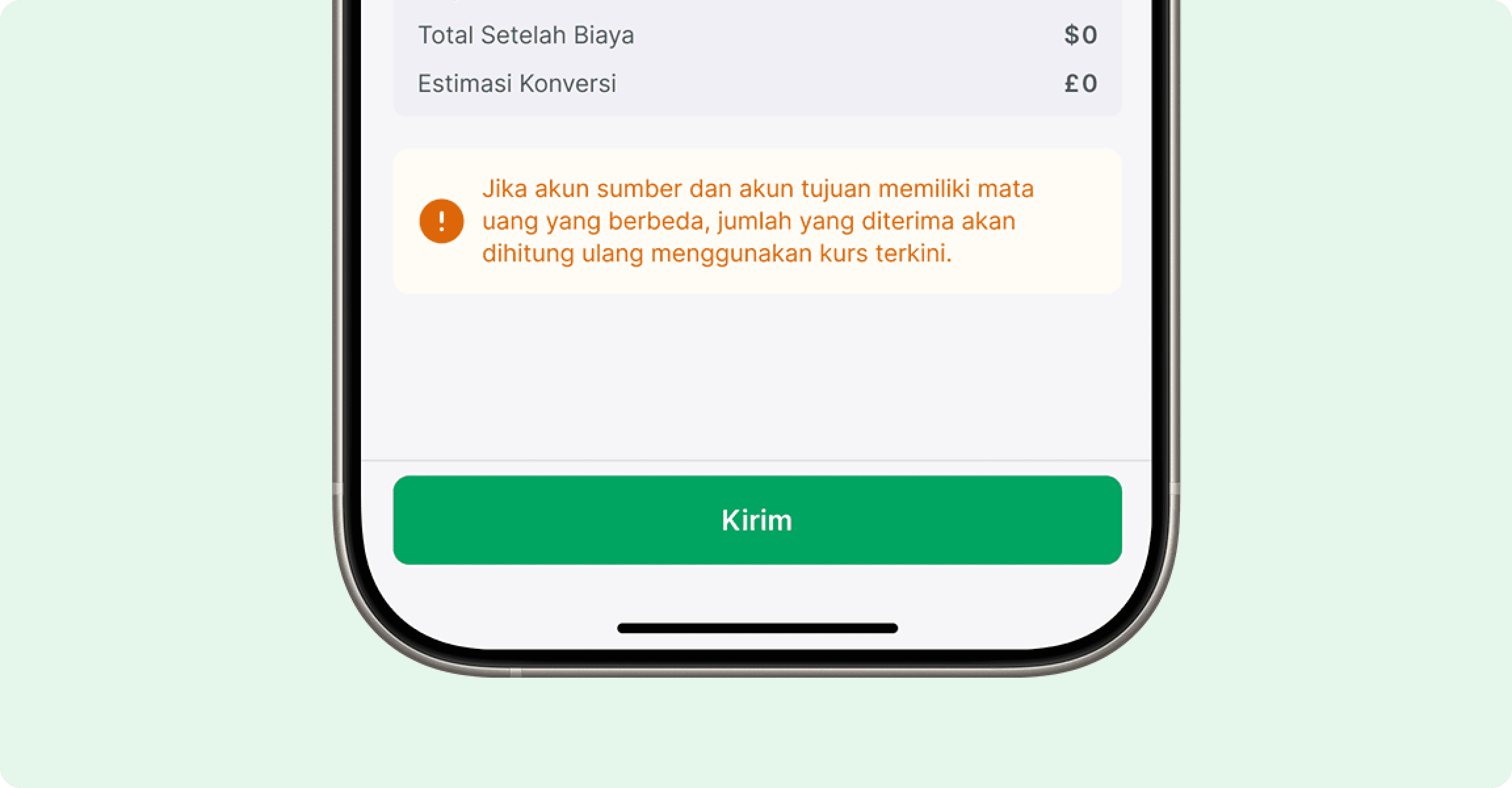
Usage
Use a button when the user needs to perform an action, such as initiating a new flow or confirming a decision. Buttons are designed to trigger immediate responses and changes within the interface. On the other hand, avoid using buttons to navigate to other pages or external resources; in those cases, a hyperlink is the appropriate choice since it clearly indicates navigation.

Do's & Don'ts
Do
Only use one primary button per section, as a main call-to-action.

Do
Use established button colors appropriately. For example, only use a danger button style for an action that’s difficult or impossible to undo.
Dont's
glassmorphism effect on text-heavy elements as it may hinder readability and legibility.